Touch-ups

Thought I would do something a little different. I'm still having a lot of fun with the X-Pro 1, so I thought that I would put up some "before postprocessing" and "after postprocessing" shots up. I'm using Lightroom 4 (trial, at the moment, but it's pretty impressive so I'll probably end up buying it).
Anyway. First pair.

This is straight out of the camera with no adjustments of any kind. It was actually about that dark, so the exposure is pretty accurate. However, we want it to look nicer. First thing is, it's not quite straight, so that needs to be taken care of. Then it needs some fill light to give detail to the bottom part and give a bit more detail to the building in the background. Then what I do is raise the "clarity" level, and that's where things get interesting. I don't know if it's the sensor, or something else, but boosting clarity on these Jpegs seems to almost give an HDR effect (the good, "oh my, look at that detail" kind, rather than the bad, "ouch, my eyes, stop it" kind). So those three things together give this:
This is no longer what I saw, but it's far more pleasing to the eyes.
Next pair
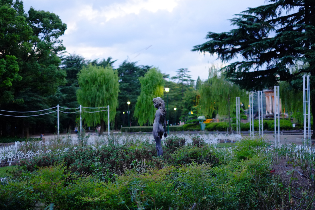
Again, straight from camera, no postprocessing. Not too bad either, it was getting pretty dark at the time and the camera captured pretty much what I saw in front of me. But we want to give this a lot more punch and make the statue stand out even more. It was shot wide open at 1.4 to get the statue "popping out", but I figured that with some adjustments to colour and then a fairly hefty boost to clarity, we'd get something better. So I boosted the greens, changed the sky a little and zoomed the clarity up high.
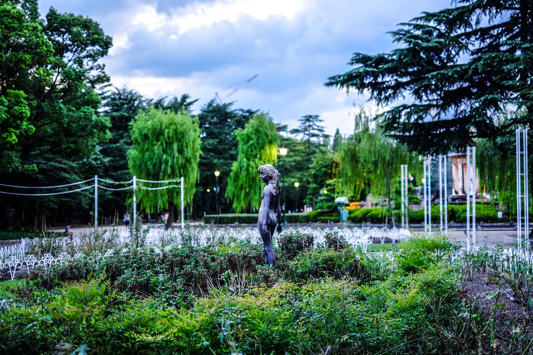
This might be too much for some people, and I'm not sure about it myself, but it's by doing things like this that you learn where the boundaries of your artistic taste lie.
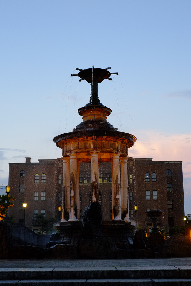
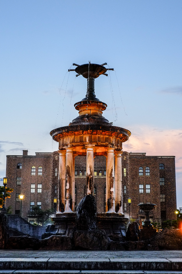
Next pair
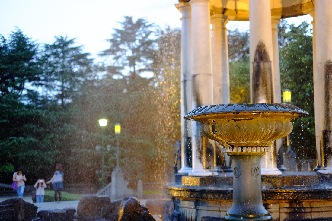
Very impressive for an unprocessed file (OK, a JPEG is technically processed, semantics fans). The focus was dead on even wide open thanks to the ability to zoom right in during manual focus. So, what we want from this picture is more sharpness, contrast and punch on the small fountain in the front.
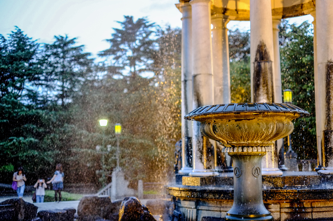
As a secondary result, this also makes the water seem more "alive"
One more fountain pair
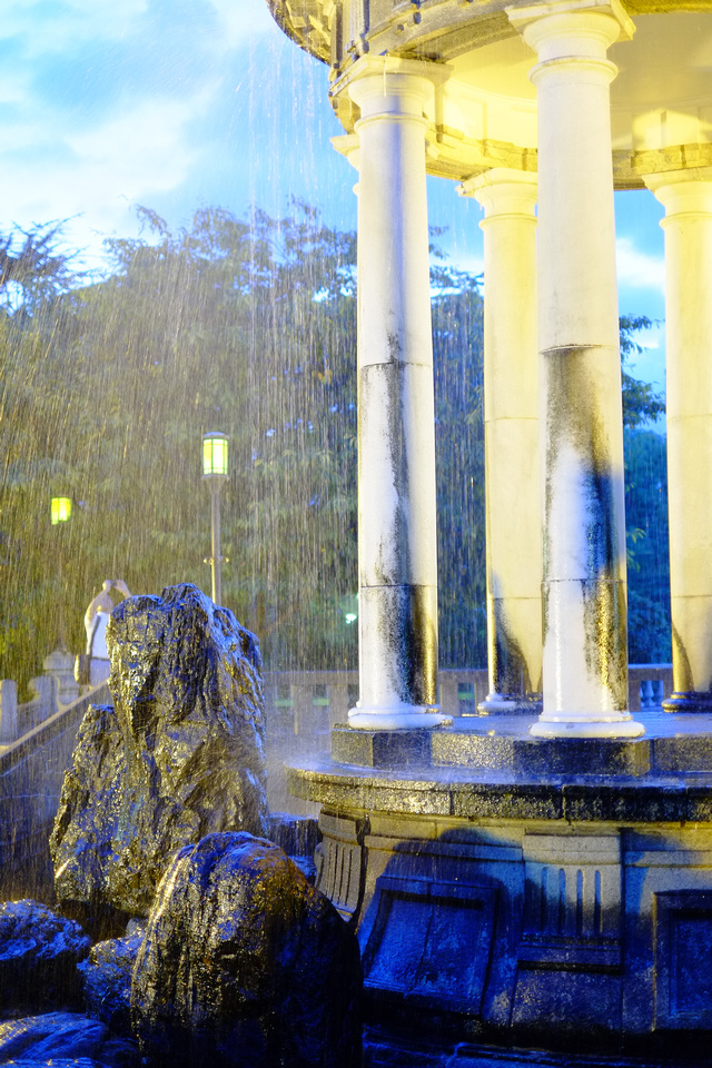
I deliberately shot this with the "wrong" white balance (incandescent) just to see what would happen. As you'd imagine, it gives a pretty heavy blue tint to things. I kind of liked it and thought it would make a good candidate for a before and after. It's pretty good as shot, but with some tweaks it gets really interesting. See what happens in particular to the rocks on the left...
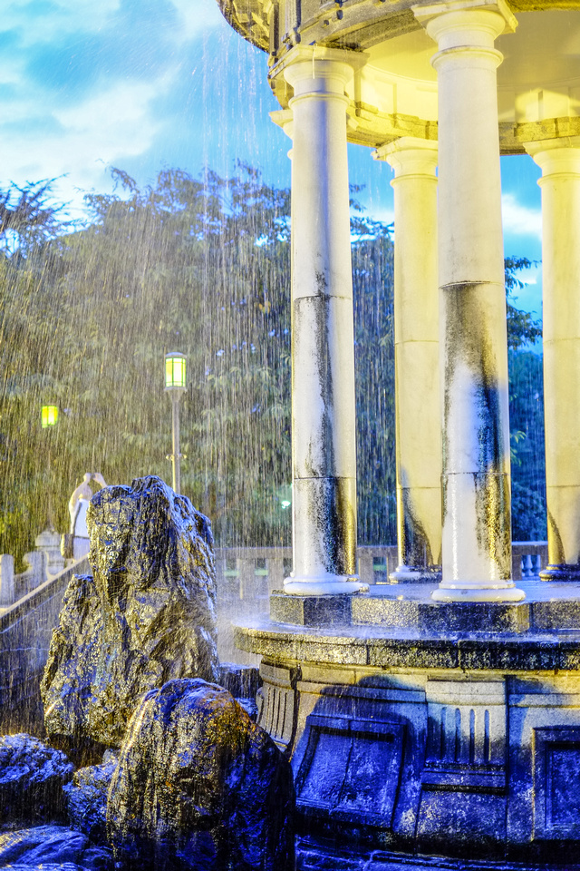
Again, it has a kind of hyper-real feeling to it, I find.
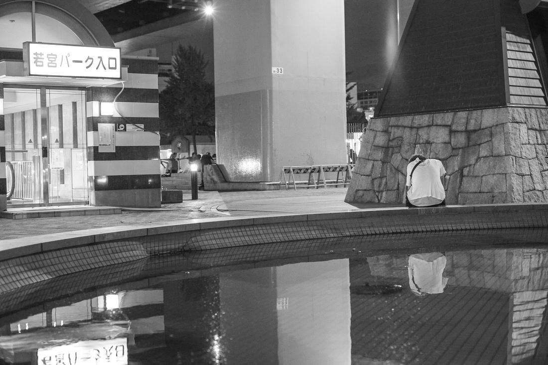
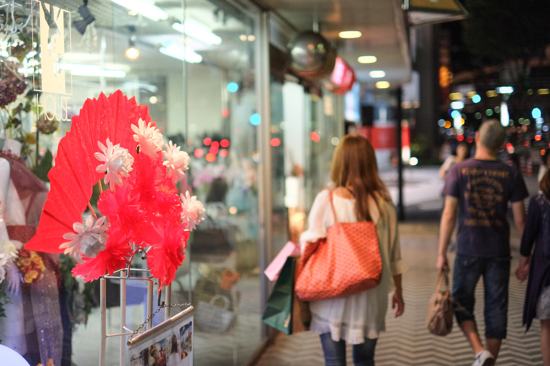
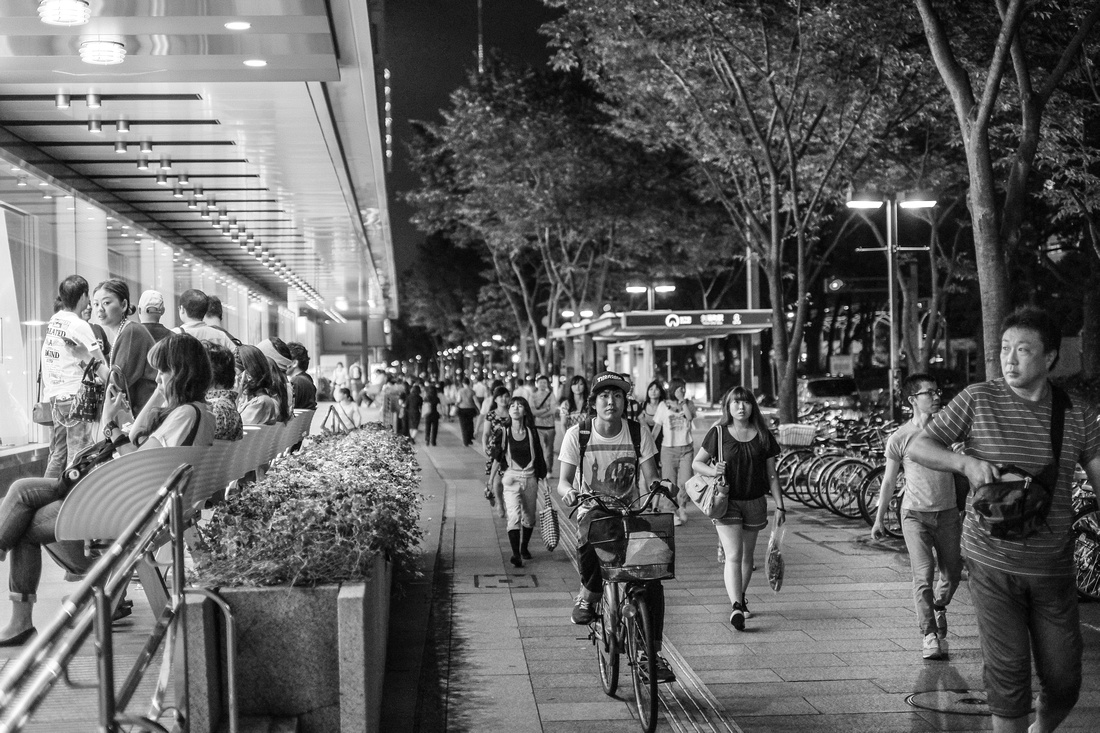
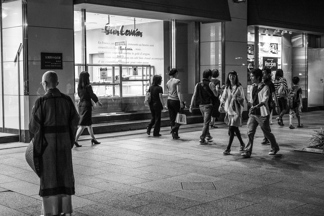
To finish off, a few street shots at high ISOs. Minimal processing on most, but again added some clarity here and there.
Thanks for looking!
Comments
This is a collection of posts. Some (most) have a particular theme, but some are just collections. I try to only include my best shots in here.
If you like what you see, please leave a message and I'll try to answer all comments.
Thank you!